Outa
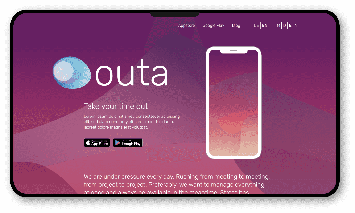
Outa is a meditation app available on iOS and Android. I helped Outa's team create a landing page and blog to help people learn more about their app.
Problem
Statement
Outa needed a website to help people learn more about the benefits their app had to offer. They knew they needed a high-performance, mobile-friendly, and accessible website to create a good first impression when people visited it. They also needed a blog, multi-language support, and color schemes for the morning, day, evening, and night. Since I had experience creating similar landing pages, I offered to help Outa create their website.
Technologies Being
Used
JavaScript
React
Proposed
Solution
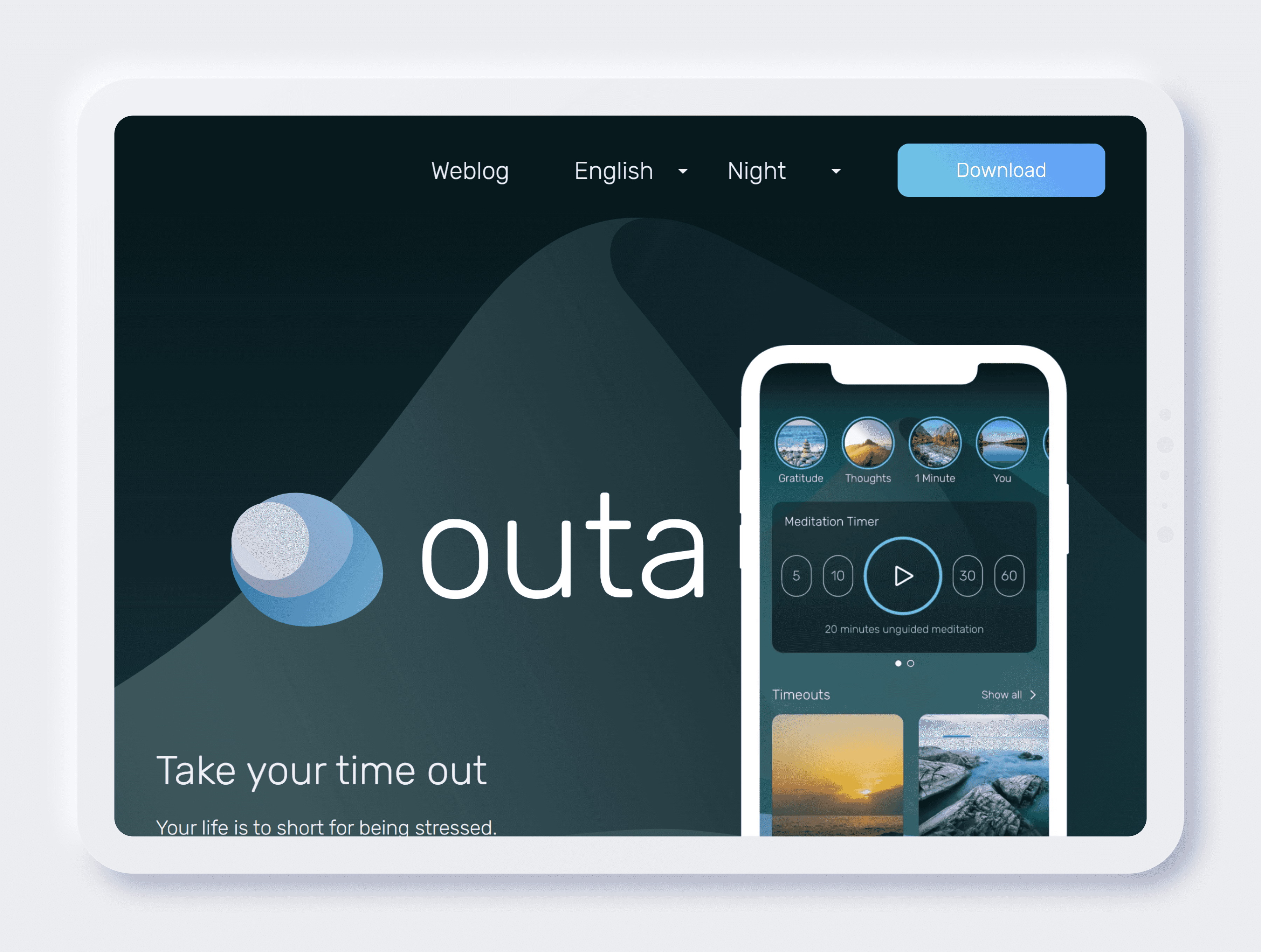
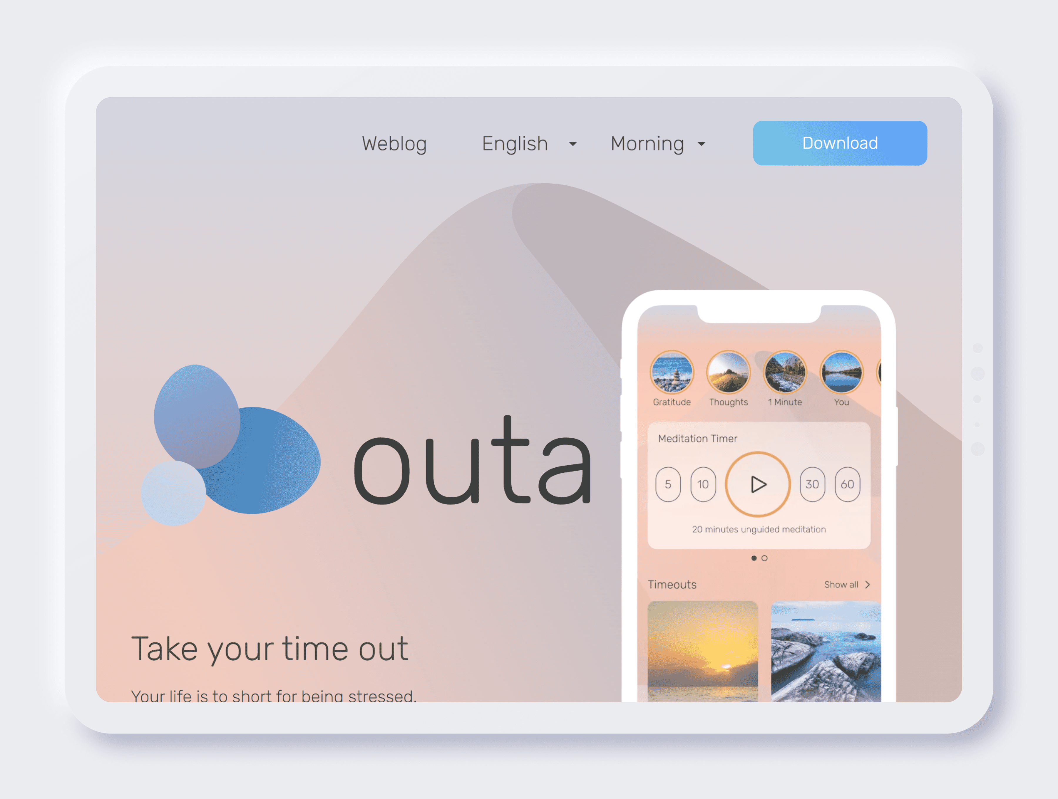
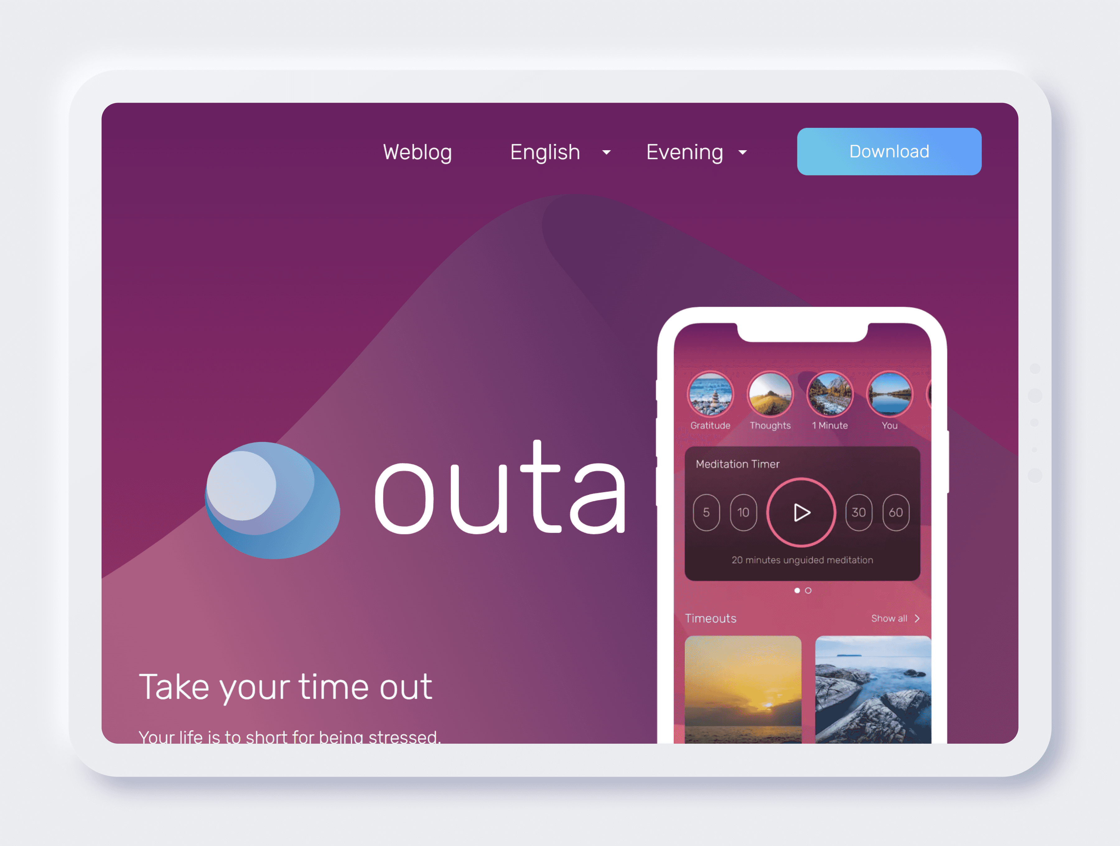
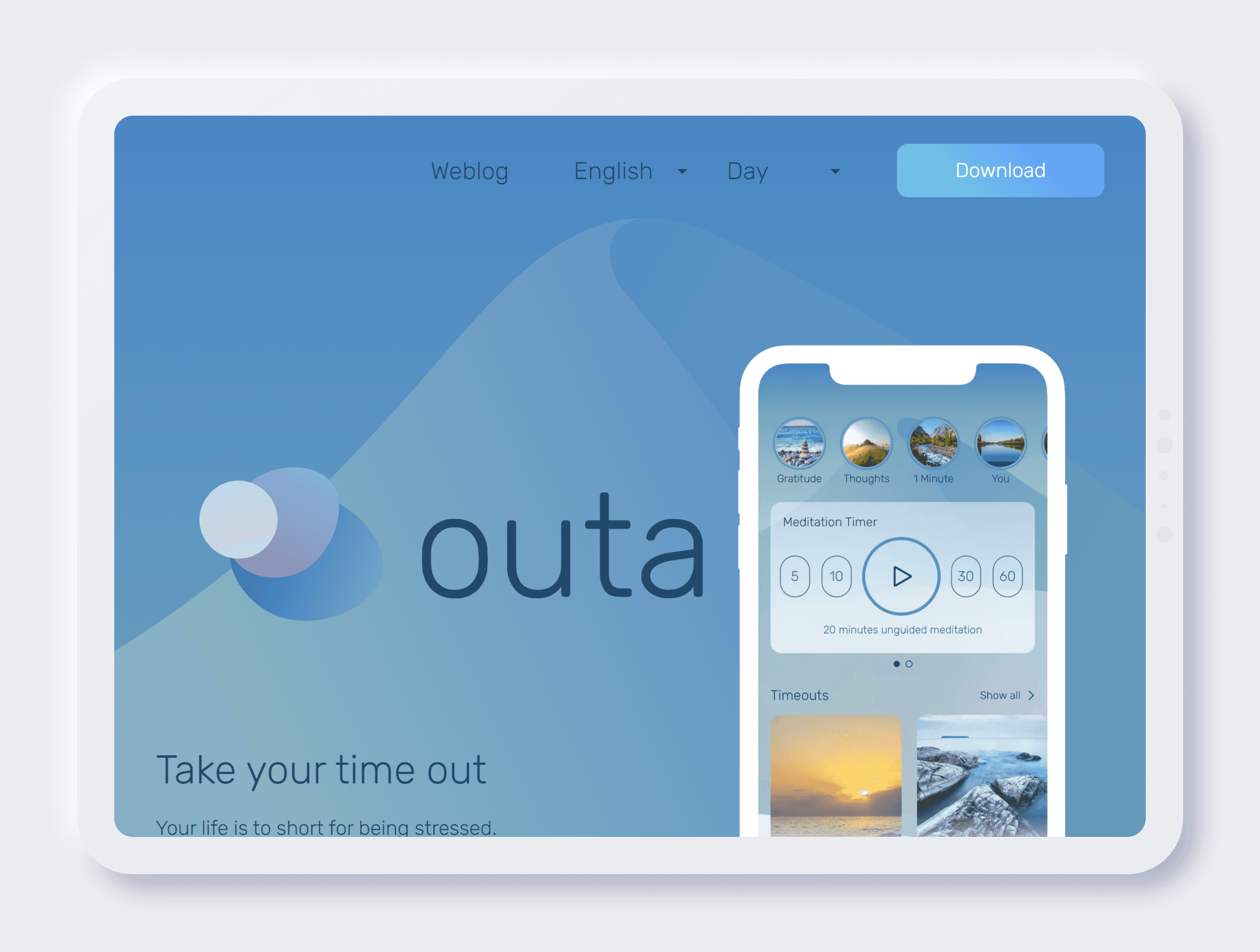
I created a blazing-fast, stunning, and responsive website with color schemes and multi-language support. I created a landing, blog overview, and post page, which you can see below. I also implemented support for English and German, and users can select their language in the navigation. I created color schemes for morning, day, evening, and night. Finally, I set up a content management system, Strapi, to help administrators easily add new content. You can see the results of my work below.

With a PageSpeed score of 90, Outa's website is also blazing fast, helping them maximize conversions.
Screenshots
Project
Results
Although the website is still in development, Outa's team has already benefited from its new website. Here are some of the results of my work:
Outa can feel confident in their brand with a blazing-fast, high-quality website that helps them create a good first impression.
With a blog and stunning landing page, Outa's website helps people learn more about their app.
With an easy-to-use content management system, they do not have to worry about updating their site's content.
Like what you saw?
Lets have a quick discussion on your project and we can get started.
